


Abstract
Efforts to understand the molecular mechanisms of COVID-19 have led to the identification of ACE2 as the main receptor for the SARS-CoV-2 spike protein on cell surfaces. However, there are still important questions about the role of other proteins in disease progression. To address these questions, we modelled the plasma proteome of 384 COVID-19 patients using protein level measurements taken at three different times and incorporating comprehensive clinical evaluation data collected 28 d after hospitalisation. Our analysis can accurately assess the severity of the illness using a metric based on WHO scores. By using topological vectorisation, we identified proteins that vary most in expression based on disease severity, and then utilised these findings to construct a graph convolutional network. This dynamic model allows us to learn the molecular interactions between these proteins, providing a tool to determine the severity of a COVID-19 infection at an early stage and identify potential pharmacological treatments by studying the dynamic interactions between the most relevant proteins.
Introduction
The sudden spread of severe acute respiratory syndrome coronavirus 2 (Sars-Cov-2) worldwide meant one of the most remarkable public health crises of recent times. Currently, more than 60 million individuals have been infected, causing over 1.5 million deaths related with severe complications of the COVID-19 disease.
There exists proved evidence on how certain proteins such as ACE2 receptor or TMPRSS2 are used by Sars-Cov-2 as entrance gates to infect the cell via membrane fusion and endocytosis (Ou et al, 2020; Zhou et al, 2020). Likewise, there are also multiple clues on a likely participation of other proteins in the downstream of the disease during its progression (Delgado Blanco et al, 2020; Yang et al, 2020; Zamorano Cuervo & Grandvaux, 2020; Scudellari, 2021). All these experimental efforts aim to characterise the progression of COVID-19 from an in situ baseline analysis of proteomic profiles. An approach that is getting more popular nowadays is to switch off those protein interactions resulting essential to the viral infection. Thus, the targeting of protein–protein interaction interfaces may be used to discover anti-COVID-19 treatment (Xiu et al, 2020; Yang et al, 2020). Unfortunately, this and most of those analyses tend to overlooking nonlinear programmes of interaction determined by subsets of proteins already described in such studies. Some of those programmes are merely contributing to an innocuous reconfiguration of the secondary immune response system, but others can be causally provoking a worsening in the severity of the symptoms (i.e., hyperinflammatory syndrome) during the disease progression.
In this work, we learn the latter through graph convolutional networks (GCNs) calibrated with higher topological features extracted from raw plasma proteomic data collected by the Massachusetts General Hospital Emergency Department COVID-19 (https://www.olink.com/mgh-covid-study/– [Filbin et al, 2021]). The examination of plasma as a potential source of insight into the evasion mechanisms of severe acute respiratory SARS-CoV-2 has been the subject of recent research (Cabrera-Garcia et al, 2022; Zhao et al, 2022). Plasma, as the liquid component of blood, is a complex mixture of substances, including antibodies and proteins produced by the host immune system in response to a stimulus, such as infection or disease. Alterations in the levels of these substances in the plasma may provide evidence of underlying conditions or disorders, even in the absence of direct evaluation of immune system cells.
Thus, we clustered and identified patient phenotypes by the World Health Organization (WHO)-mediated scores along their comorbidity effectors (if any) in a non-supervised fashion first and computed later with persistent homology of more than 1,400 protein profiles in blood enhanced in endothelial cells (see Fig 1) across samples (Xu et al, 2019). To the best of our knowledge, this study is the first to chart longitudinal associations between plasma protein interactions and disease outcomes in patients with COVID-19 disease. Finally, we are convinced our results will be instrumental in a later experimental validation.

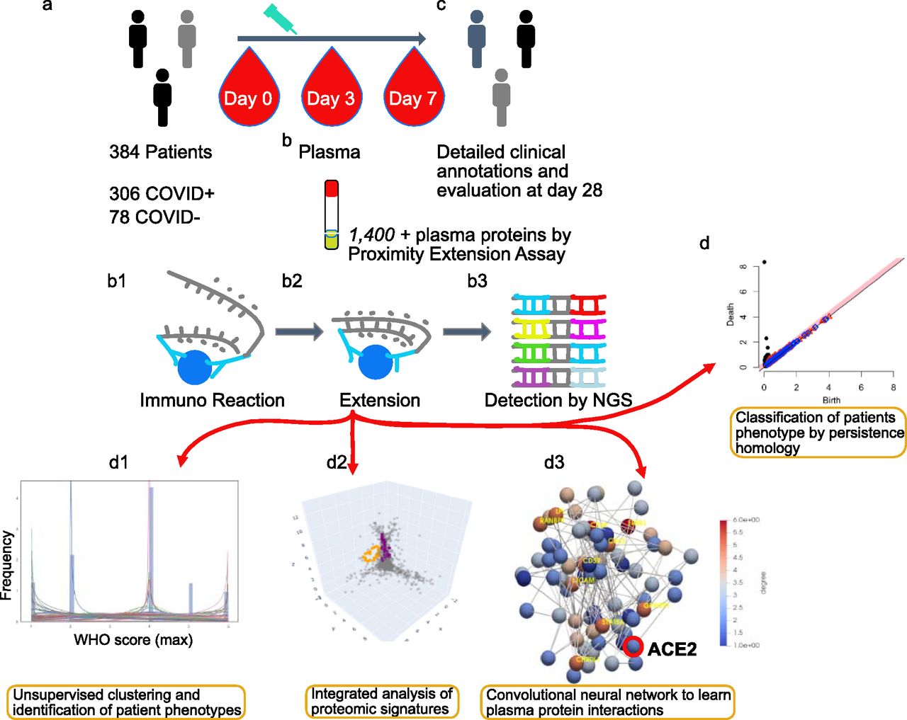
(A) Admission of inpatients presenting COVID symptoms and triage. (B) Blood extractions of inpatients at days 0, 3, and 7 after their admission. Measurement of 1,400+ plasma protein levels by proximity extension assay. (B1, B2, B3) Proximity extension assay protocol: immunoreaction, extension, and detection of levels by sequencing. (C) Record of clinical annotations and evaluation of discharged inpatients after 28 d of stay in the hospital. (D) The usage of algebraic invariants to study the shapes of each inpatient plasma proteome. (D1, D2, D3) Three stages of multi-topology analysis, namely, WHO scores of severity fitting and inpatient stratification based on that fit, protein candidates described by persistent homology per stratum, and prediction of disease progression based on convolutional neural networks constructed from those candidates and per stratum. Link https://www.olink.com/mgh-covid-study/. Modified and used with permission.
Results
Study design
Our models achieved tracking protein interactions occurring postinfection by which different levels of severity developed by 384 individuals suffering from COVID-19 symptoms might be explained (Filbin et al, 2021). In this sense, the COVID status of inpatients was tested positive prior to enrolment or during hospitalisation. Then, based on that test, we discriminated 306 patients as

(A, B, C) UMAP projection of clinical data. (A) Stratification by Covid+ and Covid−. (B) Inpatients’ stratification by WHOmax score (i.e., a measurement correlated with the maximum WHO outcomes achieved by patients during their hospital stay and available in the clinical dataset). (C) Individual discrimination by Shannon’s Entropy combined with Hdbscan clustering algorithm. The blank circles show inpatients considered as outliers by the dissimilarity of their symptoms. (D) Probability density function optimally fitted in accordance with Shannon’s Entropy displaying three sharp peaks, namely, mild, intermediate, and acute associated with inpatients of the Covid cohort.
Supplemental Data 1.
Downloadable Excel file containing variable descriptions for the clinical dataset, comparable to Table 2.[LSA-2022-01624_Supplemental_Data_1.xlsx]
Hierarchical models of WHO scale–based entropy information stratify patients by severity
WHO provides scores that monitor disease progression during a patient’s stay at a hospital. These scores, recorded using the discrete measure

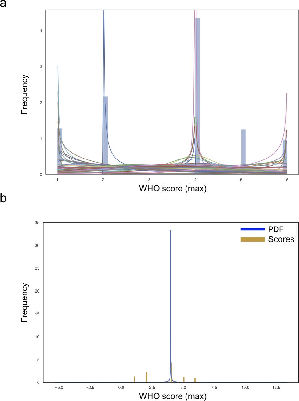
(A) All fitted distributions, i.e., arcsine, beta, gennorm, etc. (B) Proteome with the best fit distribution: generalized normal continuous distribution with β = 0.11, loc = 4.0, and scale = 0.00.
The generalised continuous normal random variable of sub-domain

To better describe the embedding progression over a variational feature, we draw upon a three dimensional design, therein, the third dimension would become a specific parameter to be set prior. Such point transition in the embedding space may be represented now as curves sequentially connecting the same point in each embedding. Colours highlight cluster divergence.
The latent space of clinical features explains patients’ stratification
We unified many local perspectives of the clinical dataset to explain models of severity progression (see Fig S3A–D). To this end, we summarised both an entire model and individual features learnt from the pdf of our Shannon’s entropy severity. This task was eventually performed using the medical outcome dataset (see Supplemental Data 2) to train a three-dense layer convolutional neural network with 269,313 trainable parameters (see Fig S4). The architecture of this network consisted of two convolutions

(A, C) show the contribution of WHO-based scores of severity and Covid+ symptoms, respectively. (B, D) are their respective interactions between a feature and all other features. In both cases, the features mostly contributing to the ranking are quite similar with possibly a greater influence of the number of features in the case of Covid+ vectorisation.
Supplemental Data 2.
Complete numerical entries for the clinical dataset of all patients.[LSA-2022-01624_Supplemental_Data_2.txt]
The model shows an input layer passed through three dense layers representing a total of 269, 313 trainable parameters: 6144 // 262, 656 // 513.
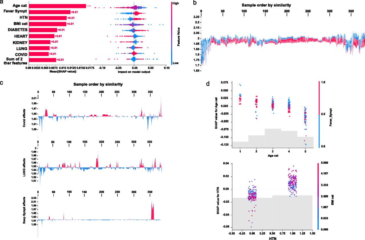
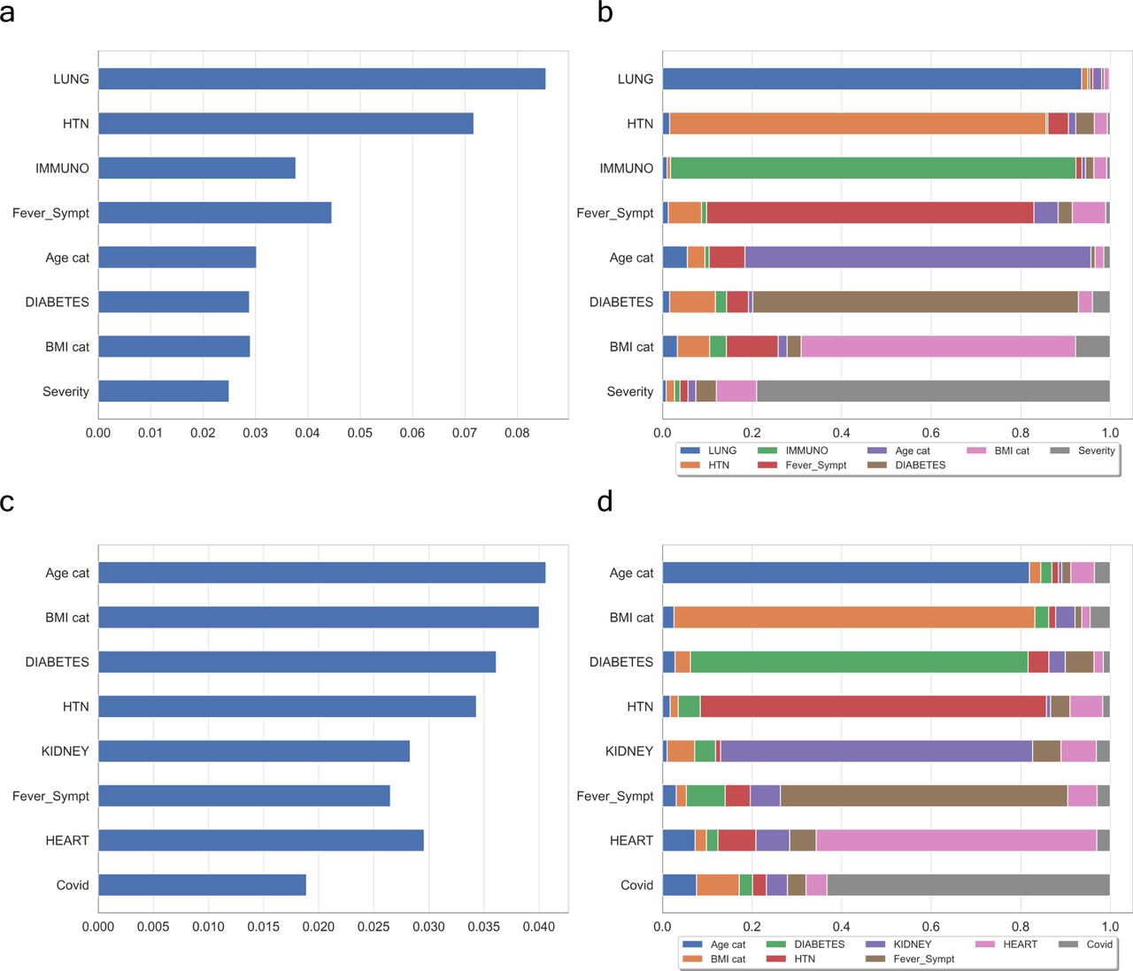
Initial explanations are based on a gradient boosted decision tree model trained on the COVID cohort. (A) Left: bar chart of the average SHAP value magnitude. Age was the most influential symptom, changing the predicted absolute COVID probability on average by two percentage points (0.02 on x-axis). Right: a set of beeswarm plots, where each dot corresponds to an inpatient in the cohort per significative symptom. The dot’s position on the x-axis shows the impact that a symptom has on the model’s prediction for a given inpatient. The piled-up dots mean the density of inpatients suffering from a symptom with similar impact on the model. Younger ages reduce the predicted Covid risk, elder ages increase the risk. (B) Globally stacked SHAP explanations clustered by explanation similarity. Inpatient profiles land on the x-axis. Red values increase the model prediction, blue ones decrease it. Two clusters stand out: On the left is a group with low predicted risk of suffering an acute Covid, whereas on the right, we have a group with a high predicted risk of suffering from acute COVID. (C) Top-bottom: locally stacked explanations clustered by explanation similarity for infection, lung, and respiratory symptoms. (D) Effect of a single feature across the whole cohort. Top–bottom: dependence plots for Age and Hypertension (HTN) features. These plots display inflection points in predicted age and hypertension as $Age cat$ and HTN (oldness by years on average and hypertension complaint per individual in the cohort) changes. Vertical dispersion at a single category of Age (resp. HTN) represents interaction effects with other features. To help reveal these interactions, we coloured by Fever (resp. BMI). We passed the whole explanation tensor to the colour argument in the dependence plots to pick the best feature to colour by. In this case, it selected fever symptoms (resp. Body Mass Index) because that highlights that the average age (hypertension) per inpatient has more (less) impact on Covid severity for categories with a low (high) Fever (BMI) value.
To understand how a single feature affects the output of the model, we plotted the local value of that feature versus the value of the feature for all the inpatients in the clinical dataset (see Fig 3B). Now, we can zoom in some of those effects individually as shown in Fig 3C for the lung and respiratory (the one quantified as lowest in its contribution to severity learning) symptoms. Because locally explained values represent a feature’s responsibility for a change in the model output, the plot in Fig 3D represents the change in predicted COVID severity as
The values of interaction between locally explained variables are a generalisation of those to higher order interactions. Fast exact computation of pairwise interactions is implemented for tree models. This returns a matrix for every prediction, where the main effects are on the diagonal and the interaction effects are off-diagonal. These values often reveal interesting hidden relationships, such as how the increased risk of death peaks for inpatients with mild febrile symptoms at the age between 20 and 34 years (see Fig 3D -upper panel-), or that non-preexisting hypertension has less impact on individuals with a high
Persistent homology identifies novel key proteomic features involved in severity
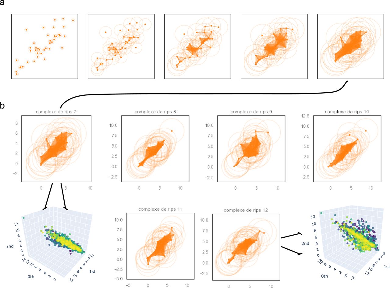
Based on the previous clinical characterisation of COVID severity, we exploited the proteomic plasma information available for the remaining 371 individuals in the cohort. Unfortunately, the particular geometry of inpatient’s proteomes as embedded onto lower dimensional spaces resulted highly sensitive to parameter setups considered in downstream analyses according to entropy-based severity. In such a scenario, we computed topological invariant structures instead (see Video 5). These invariants, the so-called simplicial complex, qualitatively analyse features that persist across multiple scales. Such invariants can be classified over days 0, 3, and 7 by obtaining their generators through persistent homology (see Fig S5A). This analysis led us to identify unique protein configurations (see Figs S5B and S6) within inpatient proteomes based on their connected components (Xia & Wei, 2014; Aktas et al, 2019). Thus, the whole universe of proteome embeddings could be enclosed in the quotient space

For the sake of simplicity, we have represented the complex filtrations with the expression of 40 soluble proteins depicted as orange points. (A) We can observe the filtration’s flow of patient 7 at levels {0.3, 0.8, 1.3, 2, 3} to be locally stratified as the severe patient 29 in the whole cohort. (B) Complex comparisons of the patients’ set {29, 32, 36, 37, 39, 42} at a fixed radius of three (resp. 7, 8, 9, 10, 11, and 12 in the local group of severe patients). There are two types of complexes spanning the whole spectrum of severe soluble proteomes (i.e., 7 and 9 on the one hand and 8, 10, 11, and 12 on the other). This is in accordance with the belonging to their prior class of equivalence as indicated by the zoom in tokens.

This time, all proteins were included in the figure. (A) Left-hand side: patient 7 coverage (i.e., patient 29 in the whole cohort). Right-hand side: patient 12 coverage (resp. 42). These are two well-defined and different complex shapes. From that behaviour, one can conclude there are no more than two classes of equivalence encoding the whole set of proteomes’ patients locally stratified as severe. This claim can be generalized to the other two groups of patients. (B) We zoomed in for the same patients on those regions with initially low resolution (white simplicial) enhancing the uniqueness of each shape per class.

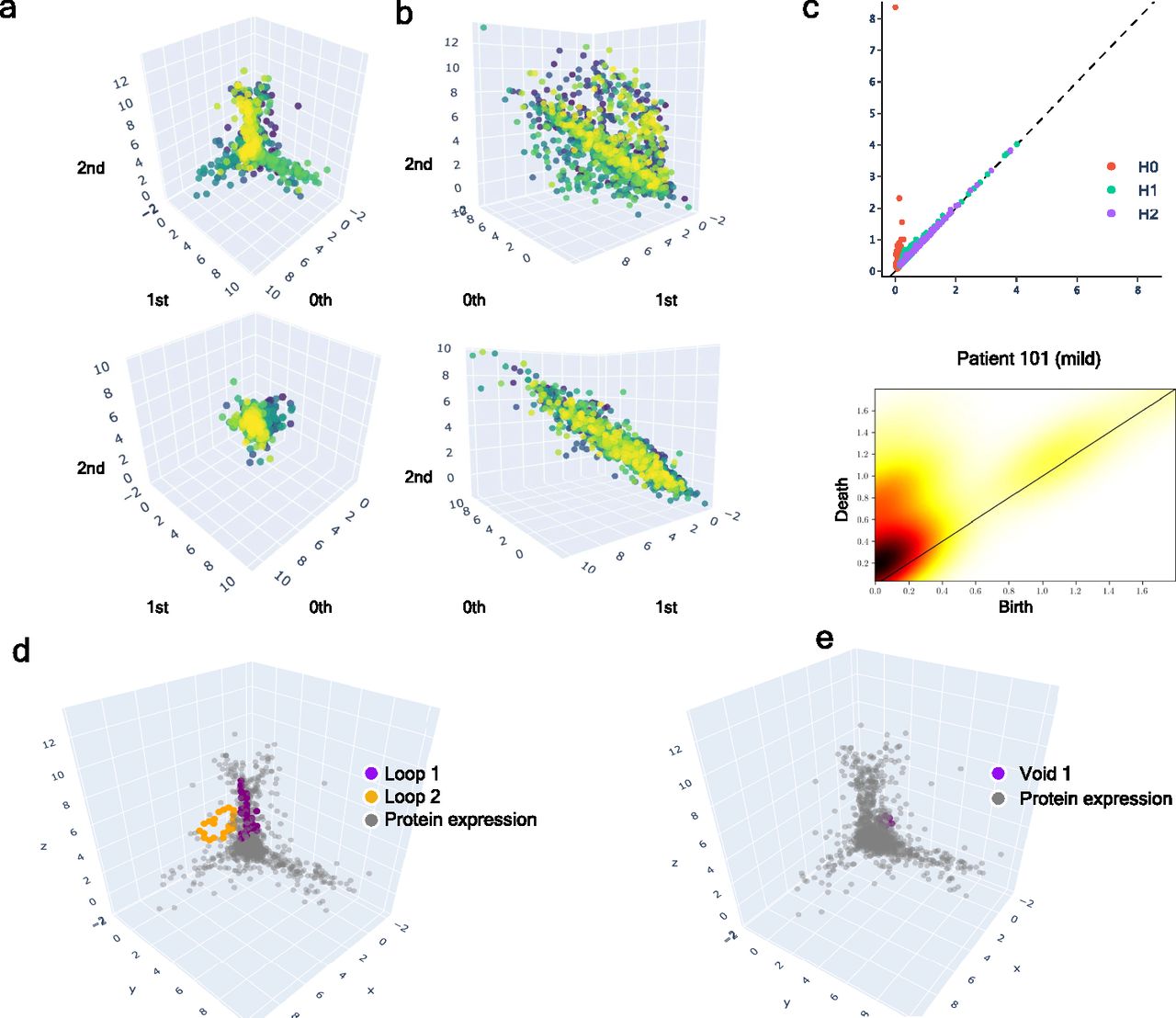
(A) Upper: class of equivalence [cb] determined by umap projection of mild inpatients upon rotation on SO(3). Lower: umap projection of an inpatient’s soluble proteome. (B) Upper: class of equivalence [ct], taking as example to show the mild inpatient 101. Lower: umap projection of that inpatient’s soluble proteome. (C) Upper: topological feature extraction from diagram of persistence of patient 101 and its later calibration. Lower: application of density diffusion for separating noise from robust signals in the persistence diagram of impatient 101. (D) Spotted loops of proteins enclosing dimension 2 structures important to explain severity stratification over time of patient 101. (E) Spotted voids of proteins enclosing dimension 3 structures important to explain severity stratification over time of patient 101.
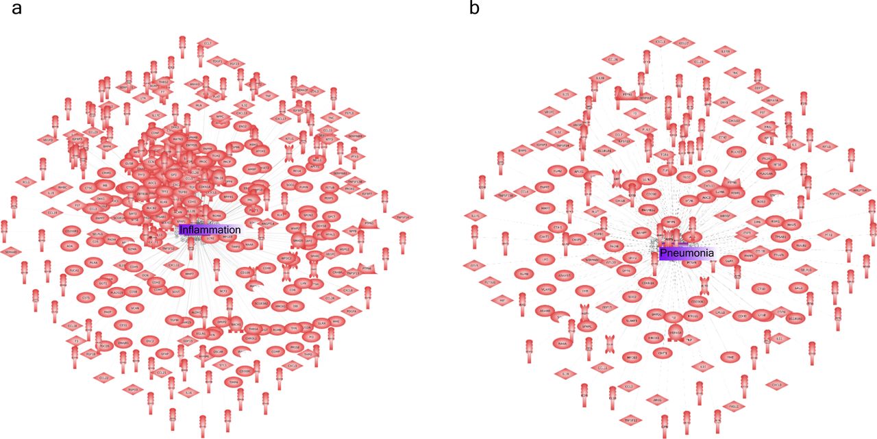
(A) Inflammation-related protein interactions before learning their dynamics by our GCN. (B) Pneumonia along with inflammation were the two most representative biological response/process triggered during COVID infection.
Dynamic tracking of protein interactions required by the virus to efficiently infect the cell
Once we put the spotlight on individual proteins topologically important to discriminate COVID patients over time, we envisaged to capture their dynamics of functional interactions at regulatory levels. To this end, integrated protein–protein interaction networks were firstly constructed per group of patients using colocalization, coexpression, physical interactions, and shared domains (Morilla et al, 2010; Warde-Farley et al, 2010). Then, we enquired these graphs about their connection quality by means of degree and centrality distributions as shown in Fig 5. Surprisingly, we could confirm (see Fig 5) that it neither was highly connected nor played an important modular role in the graphs. Next, to predict disease progression, we monitored the behavioural regulation of the nodes’ graph aggregation on semi-supervised learning on a community composed by known and unknown protein interactions with ACE2 and TMPRSS2 (Morilla et al, 2022) (see the Video 1, Video 2, and Video 3, and Video 4). To compute such a tracking, we endowed the graphs with a tailored hybrid design (see Fig S8) covered in convolutional layers along with a spectral rule (Defferrard et al, 2016) as occurs in GCNs. The first model’s performance yielded an accuracy, for each group of inpatients, of 0.49, 0.41, and 0.85 supported by 76, 146, and 355 samples regarding

(A) Mild patients. (B) Intermediate patients. (C) Acute patients. (D) Group of proteins nonfunctionally enriched in acute patients. Highlighted in red ACE2 as one initial seem in the downstream analysis of protein interactions occurred post-infection. Yellow enhances those proteins (ERBB3, CD48, CCR5, FCRL6, and PLA2G10, among others) with a higher connectivity degree in the networks.

It is composed by a hybrid model of two layers of 32 units each with active aggregation in the second model according to the formula exposed in the bottom of the figure (see the Material and Methods section). Figure modified from Morilla et al (2022) and used with permission.
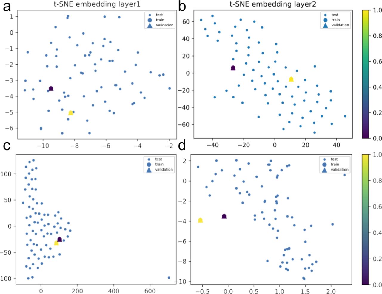
We show, through 3D data embeddings by t-SNE method, how their latent spaces re-arrange themselves as the back-propagation process runs. We clustered patient phenotypes into three differentiated profiles of the hybrid model depending on the WHO scores of maximal severity during their stays at the hospital. Thus, panels (A, B) show how Model 1 learns by layer. Then, panels (C, D) show how Model 2 does this upon inclusion of feature representations (i.e., protein interaction interfaces from ACE2 infection and those that are not ACE2-specific related). Big blue nodes are the representation of the data used to train the layer. Blue nodes are then testing samples, whereas the triangles are the layer’s output validation. Colours indicate the probability grades. As the first layer is more intuitive regarding feature representations (i.e., ACE2 protein interactions associated or not with response to viral infection), the second largely improves protein predictions even in the presence of a homogenous background.

We show, through 3D data embeddings by t-SNE method, how their latent spaces re-arrange themselves as the back-propagation process runs. We clustered patient phenotypes into three differentiated profiles of the hybrid model depending on the WHO scores of maximal severity during their stays at the hospital. Thus, panels (A, B) show how Model 1 learns by layer. Then, panels (C, D) show how Model 2 does this upon inclusion of feature representations (i.e., protein interaction interfaces from ACE2 infection and those not ACE2-specific related). Big blue nodes are the representation of the data used to train the layer. Blue nodes are then testing samples, whereas the triangles are the layer’s output validation. Colours indicate the probability grades. As the first layer is more intuitive regarding feature representations (i.e., ACE2 protein interactions associated or not with response to viral infection), the second largely improves protein predictions even in the presence of a homogenous background.

We show, through 3D data embeddings by the t-SNE method, how their latent spaces re-arrange themselves as the back-propagation process runs. We clustered patient phenotypes into three differentiated profiles of the hybrid model depending on the WHO scores of maximal severity during their stays at the hospital. Thus, panels (A, B) show how Model 1 learns by layer. Then, panels (C, D) show how Model 2 does this upon inclusion of feature representations (i.e., protein interaction interfaces from ACE2 infection and those not ACE2-specific related). Big blue nodes are the representation of the data used to train the layer. Blue nodes are then testing samples, whereas the triangles are the layer’s output validation. Colours indicate the probability grades. As the first layer is more intuitive regarding feature representations (i.e., ACE2 protein interactions associated or not with response to viral infection), the second largely improves protein predictions even in the presence of a homogenous logistic background.
Performance of the GCN hybrid model to mild COVID patients.
In that way, we learnt how ACE2 and TMPRSS2 interacted with the persistent novel candidates to explain the virus machinery at its entrance into the cell to put patients into mild, intermediate, or acute groups of severity over time (see Video 7, Video 8, Video 9, and Video 10). Hence, a primary set of proteins that led to acute severity consisted of the progressive aggregation of BCAN, CA2, CA12, CLEC4, FOLR1, FOLR2, IFNGR2, IGSF3 (R), ILR13A1(R), LAIR1, LRRN1, PCDH17, RTBDN, SEZ6L, SIGLEC6 (Schulte-Schrepping et al, 2020), and TNFRSF21 with respect to
We checked that
Regarding the
Finally, the latent
Discussion
Sars-CoV-2 has become in these two last years a real life-thread that has collapsed the health systems worldwide. Many efforts have been already done to structurally characterise the Sars-CoV-2 spike protein. To predict its severity, large mappings of proteins likely involved in the machinery applied by the virus to infect the cell have been reported (Jackson et al, 2022; Sokhansanj & Rosen, 2022). All these investigations have led to enormous advancements in COVID-19 treatment that consequently have given rise to efficient vaccines (Kumari et al, 2022). However, there is still some facets not well-characterised or yet sufficiently explored. In our attempt to contribute to this research, we computed an overall severity score based on WHO scales instrumental to provide a chart explaining the protein interactions required by the virus to stratify a patient’s infection into mild, intermediate, or acute (Organisation world health, 2021). To this end, we made use of a double analysis linking symptoms to protein expressions and interactions with ACE2 and TMPRSS2. Merely from a stratification standpoint, we give novel information and verified known facts about COVID. As conclusion, we could claim that in itself, COVID-19 is not as harmful as it is in association with other risk factors such as age, febrile symptoms, or overweight. Indeed, most of the
More importantly, we obtained functional evidence of how particular sequences of proteins interacted with the virus to block the immune systems during the infection. Thus, we could explain the infection fate towards the acute symptoms because an endosome acidification is produced during the infection initiating conformational proteins fusion (Yang et al, 2022). In that way, Sars-CoV-2 could take advantage of such pathway to be endocytosed as happens with many types of viruses such as influenza A virus, alphaviruses, or HIV-1.
Regarding patients suffering from intermediate symptoms that endocytic process is caused over proteins that contain at least one coiled domain forming stiff bundles of fibres. Hence, proteins are modified by signaling upon creation of interchain disulfide bonds, which can produce stable, covalently linked protein complexes likely contributing to fold and stabilise proteins. In virus internalization, clathrin-mediated endocytosis could be then generated in response to getting assembled on the inside face of the cell membrane to cleave the host cell (CCV) by the action of DNM1/dynamin-1 or DNM2/dynamin-2 (Jima & Hinshaw, 2018). Then, the virus may be delivering their content to early endosomes via CCV. These mechanisms could be expressing in Sars-CoV-2 using different ways as by lysing the host cell, blocking the host innate defenses via IKBKE/IKK-epsilon kinase inhibition, JAK1 protein, DDX58/RIG-I-like repector (RLR) what stabilises the antiviral state, TBK1 kinase inhibition to prevent IRF activation, or toll-like recognition receptor (TLR) pathway evasion, which makes the production of interferons to be inhibited and so to establish a stable antiviral state (Chen et al, 2021; Aliyari et al, 2022).
To mild cases, the Sars-CoV-2 protein could be preventing the tuned repertoire of self and nonself antigens’ recognition of efficiently acting against the malicious effects of cell infection. In these cases, Sars-CoV-2 would be escaping the adaptive immune response by simple interference with the presentation of antigenic peptides at the surface of infected cells (Sette et al, 2021).
The use of plasma in COVID-19 research can be justified for many reasons, even if the cells of the immune system are not evaluated directly. Plasma contains a wide range of substances produced by the immune system, including antibodies and other proteins, which can provide valuable information about the body’s response to the SARS-CoV-2 virus. By studying these substances in the plasma, researchers can gain insights into the immune system’s response to the virus and how it may help or hinder the body’s efforts to fight off the infection. Additionally, plasma can be collected and stored easily, making it a convenient and accessible source of samples for researchers studying COVID-19. Finally, plasma can be used in a wide range of experimental techniques, making it a versatile tool for researchers studying the immune system. However, it is important to note that the relationship between plasma findings and the immune system’s response is not always clear, and further research may be needed to fully understand this relationship.
The approach presented in this work provides a more comprehensive and dynamic understanding of the molecular mechanisms of COVID-19 compared to more conventional methods such as antibody testing and PCR testing. These classic methods are limited in their ability to assess disease severity and provide a snapshot of the disease state, whereas the use of protein level measurements and clinical evaluation data, combined with GCNs, provides a dynamic understanding of the molecular interactions between proteins and can help determine the severity of a COVID-19 infection at an early stage.
Whereas traditional approaches rely on identifying the presence of the virus through antibodies or PCR, this study goes beyond that to provide insights into the molecular interactions and changes in protein expression that occur during the progression of the disease. This can aid in the identification of potential pharmacological treatments by studying the dynamic interactions between the most relevant proteins.
The use of GCNs in this study provides a unique and innovative approach to understanding the complex molecular mechanisms of COVID-19, offering valuable insights for future treatment and diagnostic tool development. However, this method may need further validation before becoming a routine diagnostic tool.
Overall, the results provided in this work contribute to gaining new insights into the mechanisms of the disease and how it affects the immune system and how nonlinear relationship between “message passing” proteins could particularly explain disease severity modulation during the Sars-CoV-2 infection.
Materials and Methods
Samples
Data were provided by the Massachusetts General Hospital Emergency Department COVID-19 with Olink proteomic (publicly available at https://www.olink.com/mgh-covid-study/). Clinical dataset and plasma proteomes of 384 adult patients were distributed in 306
Variable descriptions of the clinical dataset.
Interpreting latent space of clinical features
The Shapley values are a widely used approach in cooperative game theory which have advantageous properties, as described by Yoshida et al (2020). These properties facilitate a clear understanding of the computation and interpretation of Kapley values as explanations for machine learning models. This is achieved through an empirical approach using the shap Python package, which demonstrates the explanations for increasingly complex models (Lundberg & Lee, 2017). In this study, we apply Shapley values to explain the predictions made by a neural network model trained on clinical variables. The model was trained using the “adam” optimizer and “binary cross entropy” loss functions (Chollet et al, 2015) to uncover why it makes different predictions for different individuals. To use SHAP, the model must take a 2D numpy array as input; so, a wrapper function was defined around the original Keras predict function (Chollet et al, 2015). To explain a single prediction (as shown in Fig 3A), 50 samples from the dataset were selected to represent typical feature values and 500 perturbation samples were used to estimate the SHAP values, which required 500 * 50 evaluations of the model. To explain many predictions, the above process was repeated for 50 individuals. Note that as this explanation is based on a sampling approximation, each explanation may take a few seconds, depending on the machine setup (as shown in Fig 3B–D).
Notes on persistent homology (multi-topology)
Persistent homology is a mathematical theory used as a tool in topological data analysis (TDA) to study the topological features of a dataset (i.e., plasma proteome of each patient in the cohort). It is a type of algebraic topology that uses algebraic invariants to study the shapes of data. The main idea behind persistent homology is to study how the topological features of a dataset change as the scale of observation changes. This is often done by constructing a sequence of simplicial complexes from the data, each of which represents the data at a different scale, and then studying how the topological features of these simplicial complexes evolve over time.
In TDA, persistent homology is used to identify topological features of a dataset that are persistent, or stable, over a range of scales (i.e., multi-scale topology). These persistent features are considered to be the most significant topological features of the data, and they can be used to distinguish different classes of data or to identify patterns in the data. To use persistent homology in TDA, one typically starts by constructing a simplicial complex from the data, and then applying algebraic topology techniques to study the topological features of the complex. This can be done using specialised software tools, such as GUDHI, DIPHA, or Dionysus (Maria et al, 2014; Gillani et al, 2016; Tauzin et al, 2020), which are designed to compute persistent homology and other topological invariants.
Notes on the GCN
We endowed the regulatory persistent-based protein networks with a convolutional design (i.e., neural networks) along with a spectral rule of node aggregation as in GCN (Defferrard et al, 2016). The sequential combination of two hybrid models enabled the learning of interactions between ACE2 and TMPRSS2, and the persistent proteins needed by the virus to be spread in cells. Following this reasoning, we primarily made use of the identity matrix I as features and the adjacency matrix A (Model 1) contributing the model in the following spectral rule:
Ethics Statement
The Partners Human Research Committee approved the collection and analysis of samples and waived the requirement for informed consent.
Data Availability
All data used in this work are included in the article and/or supplementary material.
Acknowledgements
We would like to thank the funding from the National Research Association (ANR) (Inflamex renewal 10-LABX-0017 to I Morilla), Consejería de Universidades, Ciencias y Desarrollo, fondos FEDER de la Junta de Andalucía (ProyExec_0499 to I Morilla), DHU FIRE Emergence 4, and the l’Agence de la Biomédecine.
Author Contributions
S Gauthier: data curation and formal analysis.
A Tran-Dinh: methodology, and writing—original draft, review, and editing.
I Morilla: conceptualization, data curation, formal analysis, supervision, funding acquisition, investigation, visualization, methodology, project administration, and writing—original draft, review, and editing.
Conflict of Interest Statement
The authors declare that they have no conflict of interest.
- Received July 22, 2022.
- Revision received February 6, 2023.
- Accepted February 6, 2023.
- © 2023 Gauthier et al.
This article is available under a Creative Commons License (Attribution 4.0 International, as described at https://creativecommons.org/licenses/by/4.0/).
References


In this Issue
Related Articles
Cited By...
- No citing articles found.